Introduction to Typography
Typography is the art and technique of arranging type to make written language legible, readable, and visually appealing when displayed. It encompasses various elements including font choice, size, spacing, and line length, making it a crucial aspect of graphic design and an influential factor in communication. From newspapers to advertisements and literature, typography enhances the aesthetic appeal of printed materials while conveying the intended message effectively.
The origins of typography can be traced back to the invention of the printing press by Johannes Gutenberg in the 15th century, which revolutionized the way text was produced and disseminated. The subsequent advancements in type design and printing technologies led to a rich history characterized by numerous styles and movements, such as serif, sans-serif, script, and decorative fonts. Each type of font carries with it unique characteristics influencing how messages are perceived. Serif fonts, for instance, are often associated with tradition and reliability, while sans-serif fonts lend a modern and clean appearance.
Over the years, typography has evolved significantly, transitioning from the physical typesetting of metal letters to the digital realm where designers now have access to an almost limitless selection of typefaces. This evolution has empowered creators to explore various dimensions of typography, making it a vital component of design. Furthermore, the rise of web fonts and responsive typography has underscored the necessity for adaptability across different platforms, providing consistent user experiences across devices.
In contemporary design, understanding typography is imperative. It not only enhances the aesthetic value of printed materials but also plays a pivotal role in setting the tone and voice of a project. As such, designers must carefully consider each typeface chosen, as it can evoke specific emotions and shape the audience’s understanding and engagement with the content.
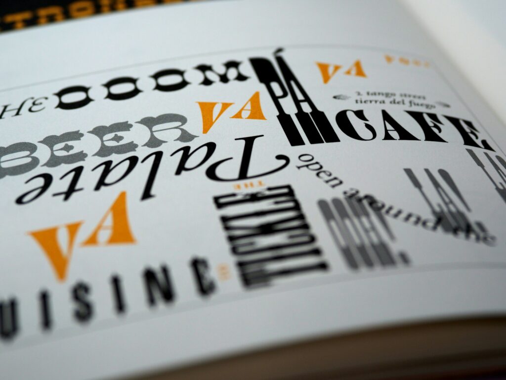
Understanding Font Categories
Typography plays a vital role in the success of printed materials, and understanding the different categories of fonts is essential for effective communication. The main font categories include serif, sans-serif, script, and decorative, each serving distinct purposes and influencing audience perception.
Serif fonts are characterized by small lines or embellishments at the ends of their letterforms. Common examples include Times New Roman and Georgia. These fonts convey formality, tradition, and reliability, making them ideal for printed materials like newspapers, books, and formal invitations. The presence of serifs aids in guiding the reader’s eye along a line of text, enhancing readability. Thus, they are often favored in professional and academic contexts.
In contrast, sans-serif fonts lack these decorative strokes, presenting a cleaner and more modern appearance. Popular examples are Arial and Helvetica. With their straightforward design, sans-serif fonts exude a sense of simplicity and clarity, making them suitable for online content, brochures, and contemporary branding. Their minimalistic nature often evokes feelings of openness and accessibility, appealing to a younger and more diverse audience.
Script fonts mimic the fluidity of handwriting and are often ornate in style. Fonts like Brush Script and Pacifico are perfect for adding a personal touch to invitations, greeting cards, and celebratory materials. While they create a warm and friendly atmosphere, their readability decreases at smaller sizes, so their use should be limited to headings or short texts where impression matters most.
Lastly, decorative fonts serve specialized purposes with unique styles and themes, such as Gothic or vintage looks. Although these traits can add personality to marketing flyers or posters, they can be overwhelming if overused or applied improperly. Understanding the emotional responses each font category elicits enables a more strategic approach when selecting typography for printed materials.
The Impact of Font Selection on Readability
The selection of fonts plays a critical role in enhancing the readability of printed materials. It encompasses more than just aesthetics; it affects how easily the reader can engage with the content. Various factors, including font size, line height, and letter spacing, significantly contribute to the overall reading experience. Each of these elements must be thoughtfully considered to ensure that the message is communicated effectively.
Font size is one of the most immediate factors impacting readability. Generally, a larger font size improves visibility and allows for easier reading, especially for individuals with visual impairments. For instance, a font size of at least 10-12 points is often recommended for body text. However, larger sizes might be necessary in specific contexts or for older demographics. On the other hand, text that is too large can overwhelm the reader, disrupting the visual flow.
Line height, or leading, also plays a vital role in readability. Proper line height helps to create a comfortable reading experience by providing enough space between lines of text. A line height that is too tight can lead to eye strain, whereas excessive spacing may cause readers to lose their place. It is typically suggested that line height be set at 1.5 times the font size to achieve optimal reading comfort.
Lastly, letter spacing, or tracking, affects the legibility of words on a page. Sufficient spacing between letters enhances clarity, making it easier for the reader to distinguish each word. In particular, narrower letter spacing can cause words to blend, creating a perception of clutter on the page. Therefore, adjusting letter spacing according to the typeface can substantially improve the text’s overall readability.
In summary, careful consideration of font selection regarding size, line height, and letter spacing is essential for crafting clear and legible printed materials. These factors contribute significantly to the overall reading experience and should not be overlooked in the design process.
Combining Fonts: A Harmonious Approach
Effective typography plays a crucial role in enhancing the visual appeal of printed materials. One key aspect of typography is the art of combining fonts to create a harmonious design that captures the essence of a project. A well-executed font pairing can significantly impact readability and aesthetics, ensuring that the message resonates with the audience. When selecting complementary fonts, several guidelines can help designers create a balanced and effective visual hierarchy.
The first consideration in combining fonts is contrast. A successful pairing often involves contrasting styles, such as a serif and sans-serif typeface. For instance, a bold serif font can be paired with a clean, modern sans-serif font to create a visual distinction between headings and body text. This contrast not only enhances legibility but also guides the reader’s attention toward important elements. Additionally, it is crucial to consider the weight and style of the fonts, as combining excessively similar types can lead to confusion and a lack of visual interest.
Another vital aspect is the hierarchy of text. Designers should establish a clear distinction between different sections of the content by varying font sizes, weights, and styles. For example, using a larger, bolder font for headlines while maintaining a more subdued style for body text can create a clear visual structure. Examples of successful font pairings include using a classic serif font like Garamond for headings with a clean sans-serif font like Helvetica for body text, which creates contrast while still feeling cohesive.
Consistency is also paramount when combining fonts. It is advisable to limit the number of typefaces used in a single project to maintain a uniform look. Typically, using a maximum of two to three fonts can be effective in creating a clean and professional appearance. By following these guidelines, designers can achieve a harmonious approach to font combination, ultimately elevating the quality of printed materials.
Color Theory and Typography
The relationship between color and typography is pivotal in the realm of printed materials. Color not only attracts attention but also evokes emotions, tells a story, and aids in conveying the intended message of a design. When selecting fonts and colors for your project, it is crucial to recognize how different colors impact the perception of typefaces. For instance, a bold black font may convey strength and reliability when set against a vibrant red background, while the same font on a softer pastel hue may evoke warmth and approachability.
Understanding basic principles of color theory can greatly enhance the effectiveness of typography in print. Colors can be categorized as warm (reds, oranges, yellows) or cool (blues, greens, purples), and these categories significantly influence viewer psychology. Warm colors tend to stimulate and energize, making them suitable for headlines or calls to action, while cool colors can create a sense of calm and professionalism, thereby complementing body text or informational content. It is essential to align your color selections with the emotions and actions you wish to elicit from your audience.
Creating a harmonious color scheme is vital for effective typography. Consider utilizing the color wheel to find complementary or analogous color combinations. These techniques can help ensure that your chosen font stands out without overwhelming the viewer. Moreover, maintaining adequate contrast between your text and background is indispensable for readability; for example, light text on a dark background can be visually striking when done correctly. Ultimately, a well-considered integration of color theory and typography can result in printed materials that are not only aesthetically pleasing but also functional and impactful.
Typography and Branding
Typography plays a crucial role in branding as it effectively communicates a brand’s identity to its audience. The choice of font in printed materials can significantly influence perceptions and convey brand values. For instance, a clean, modern sans-serif font may evoke a sense of innovation and professionalism, appealing to tech-savvy consumers. Conversely, a handwritten script font can convey a sense of warmth and approachability, which may resonate well with a lifestyle brand aimed at a more casual audience. The selection of typography is not merely an aesthetic decision; it can also inform the emotional response of the target audience.
Consistency in typography serves to strengthen brand recognition. By employing the same fonts across all marketing materials, brands create a coherent visual language that helps consumers easily associate the typography with the brand itself. For example, Coca-Cola’s distinctive Spencerian script is immediately recognizable and has been a critical component of its branding since its inception. This consistent use of typography reinforces the brand’s identity, making it instantly identifiable even without the accompanying logo.
Another notable example is Apple, which utilizes a modern sans-serif font called San Francisco. This choice aligns seamlessly with their brand ethos of simplicity, elegance, and functionality. The consistency in their typography across different platforms, from product packaging to advertisements, reflects their commitment to high-quality, user-friendly design. Such strategic typographic choices effectively communicate the values and personality of the brand, helping to forge a strong emotional connection with consumers.
In essence, the thoughtful selection and consistent application of typography contribute significantly to effective branding. Typography not only aids in conveying a visual identity but also facilitates emotional engagement, making it a vital component of any branding strategy.
Technical Considerations for Printing Fonts
When preparing fonts for print, several technical aspects must be taken into account to ensure high-quality results. One of the primary considerations is the file format of the fonts. Commonly used formats include TrueType (.ttf) and OpenType (.otf), which both support various typesetting features and are widely accepted by design software. It is crucial to verify that the chosen format is compatible with the intended print process, as some printers may have specific requirements.
Another significant factor is resolution. For printed materials, a resolution of 300 dpi (dots per inch) is typically recommended to maintain clarity and crispness. This resolution ensures that the fine details of the fonts are preserved during the printing process. When exporting files, designers should select the appropriate resolution settings in their design software to avoid pixelation or blurriness, which could detract from the professional appearance of the final product.
Additionally, understanding printer specifications is essential. Each printer may have varying capabilities and limitations, such as supported color profiles or maximum print dimensions. Consulting the printer’s guidelines before finalizing a project helps optimize the design’s output and reduces the likelihood of unexpected issues arising during printing.
Equally important is the proper embedding or outlining of fonts. Embedding fonts ensures that the typography appears as intended on any device, while outlining fonts converts them to vector shapes, eliminating any dependency on the original font files. This step is vital especially when sharing files with printing services to avoid discrepancies in typography. Design software often provides options for both embedding and outlining, so utilizing these features can streamline the process.
Finally, designers should familiarize themselves with the settings of their software to achieve optimal results. Regularly updating design applications can improve performance and introduce new tools that enhance font management. By following these technical considerations, designers can significantly improve the quality and effectiveness of their printed materials.
Current Trends in Typography for Print
The landscape of typography for printed materials is ever-evolving, with contemporary trends showcasing innovative styles and applications that significantly enhance visual communication. One of the notable trends is the resurgence of serif fonts, which, despite being perceived as classic, have found fresh interpretations. Designers often opt for modern serif variations, which convey sophistication while still maintaining readability. This balance allows for impactful messaging, especially in editorial layouts and branding materials.
Sans-serif fonts have also continued to dominate the print industry. Their clean lines and minimalist aesthetic make them ideal for various applications, ranging from posters to brochures. The trend leans toward bold weights, allowing for headlines that draw immediate attention. Coupled with effective spacing and alignment, these fonts contribute to a more dynamic visual hierarchy, ensuring that crucial information is conveyed with clarity and style.
Another remarkable trend is the increasing popularity of custom typography. This approach allows brands to express their unique identity and stand out from the competition. Custom fonts tailored to fit specific themes or messages can evoke emotions and resonate more deeply with target audiences. When implemented effectively, they create a cohesive visual narrative that enhances overall brand recognition.
Furthermore, layering and overlapping text with images have emerged as effective techniques in contemporary print design. This innovative use of typography creates depth and interest, engaging the viewer in a multi-dimensional experience. Additionally, color plays a vital role, with vibrant hues being paired with neutral backgrounds to create striking contrasts that enhance legibility.
Designers and creators are encouraged to stay updated on these evolving trends in typography. By understanding and integrating current styles into printed projects, one can foster a powerful connection with audiences and ensure their printed materials remain not only relevant but also visually appealing.
Conclusion: The Power of Typography in Design
Typography plays a crucial role in shaping the visual appeal and efficacy of printed materials. Throughout this discussion, we have explored the fundamental principles of typography, such as font selection, readability, and the emotional resonance of different typefaces. By carefully selecting appropriate fonts, designers can significantly enhance the overall aesthetics of their projects, ensuring that the intended message is clearly communicated to the audience.
The choices made regarding typography can influence not only the look of a design but also its functionality. For instance, using a bold typeface for headlines can capture attention effectively, while a more understated font can provide clarity and simplicity in body text. Moreover, the size and spacing of text contribute to the readability of printed materials, making it essential for designers to pay close attention to these elements.
Our exploration highlighted the importance of consistency in font use, which aids in creating a coherent visual identity. This consistency ensures that printed materials maintain an aligned image with the brand’s values and messaging. Moreover, by incorporating appropriate typographic hierarchy, designers can guide the reader’s eye through the content, ensuring a smooth reading experience that keeps audiences engaged.
In conclusion, it is vital for designers to thoughtfully consider their font choices and apply the typography tips discussed throughout this article to elevate their design projects. By harnessing the power of typography, individuals can create printed materials that stand out, resonate with audiences, and foster effective communication. Typography is not merely an aesthetic choice; it is an instrumental tool in design that can leave a lasting impact on how information is perceived and valued by all who encounter it.