Introduction to Typography
Typography is a crucial aspect of design that influences the way text is presented and perceived. It encompasses the selection and arrangement of typefaces to create visually appealing and effective communication. The significance of typography extends beyond mere aesthetics; it plays a pivotal role in conveying meaning, emotion, and brand identity. As designers, understanding typography is essential for enhancing overall visual communication and ensuring that the message is delivered clearly and engagingly.
One of the most foundational elements of typography is typeface selection. Different typefaces evoke distinct emotions and align with varied brand identities. For instance, serif fonts are often associated with tradition and reliability, whereas sans-serif fonts are seen as modern and clean. Selecting the appropriate typeface for a given design project can greatly affect the audience’s perception and comprehension of the content. Furthermore, the choice of a typeface should take into consideration the target audience, brand persona, and the context in which the text will be displayed.
In addition to typeface selection, effective font pairing is another essential aspect of typography. Combining complementary fonts can create visual harmony, enhancing the overall design while maintaining readability. Designers must be mindful of contrast and legibility when pairing fonts, as mismatched combinations can detract from the message being communicated. A solid understanding of typographic hierarchy, which includes variations in weight, size, and spacing, is vital for guiding the viewer’s eye and emphasizing key information within a layout.
Overall, typography is a multifaceted discipline that demands attention to detail and an appreciation for the artistry involved in type selection, pairing, and arrangement. By mastering these elements, designers can elevate their work and effectively communicate their intended messages. This foundation is critical for anyone seeking to improve their skills in typographic design.
Understanding Typefaces and Fonts
The terms ‘typeface’ and ‘font’ are often used interchangeably, but they reflect distinct concepts in typographic design. A typeface refers to a specific design of lettering that encompasses a variety of styles, weights, and sizes. For example, Arial is a typeface, while Arial Bold Italic is a distinct font under the Arial typeface. Understanding this difference is essential for designers seeking to choose the right type for their projects effectively.
Typefaces can be categorized into several groups, each with unique characteristics that serve different purposes. One primary category is serif typefaces, which feature small lines or embellishments at the ends of their strokes. They are often perceived as traditional and formal, making them suitable for print media such as books and newspapers. Popular serif typefaces include Times New Roman and Garamond.
In contrast, sans-serif typefaces lack these decorative elements, resulting in a cleaner and more modern appearance. Their straight lines and smooth edges contribute to better readability on screens, making them an excellent choice for websites and digital interfaces. Examples of sans-serif typefaces include Helvetica and Arial.
Display typefaces are designed for attention-grabbing headlines rather than extensive body text. These typefaces often feature unique or artistic designs that convey a specific theme or brand personality. Using display typefaces sparingly can create striking visual interest in a design. Conversely, script typefaces mimic handwriting, offering a more personal and artistic touch. However, they should be utilized cautiously as they can be less legible in longer passages of text.
By understanding the various categories of typefaces and their characteristics, designers can make informed decisions when selecting the appropriate types for their projects, leading to enhanced readability and effective communication in their designs.
Common Typographic Mistakes
In the realm of design, typographic choices play a critical role in communicating messages effectively. However, designers often encounter a variety of common typographic mistakes that can undermine their efforts. One of the most pervasive errors is improper line spacing, known as leading. When lines of text are spaced too closely together or too far apart, it can create confusion and hinder the reader’s ability to absorb the content. Ideal line spacing strikes a balance that enhances readability while maintaining visual appeal, contributing positively to the overall design.
Another frequent oversight is selecting inappropriate fonts for the intended message. Designers may choose overly elaborate or decorative typefaces, which can distract from the content rather than complement it. This often results in reduced clarity and comprehension, ultimately undermining the purpose of the design. It is advisable to select fonts that reflect the tone of the content while ensuring adaptability across various mediums, from print to digital formats. Furthermore, mixing too many font styles within a single project can lead to an unprofessional appearance. Limiting font selections to a maximum of three can provide a cohesive and visually appealing layout.
Unbalanced layouts also stand out as a significant typographic mistake. Disorganized text placement can create visual chaos, detracting from the reader’s experience. It is essential to establish a hierarchy through appropriate font sizes and weights, guiding the audience’s eye seamlessly through the content. Consistency in formatting, such as alignment and spacing, further supports a visually balanced design. By addressing these common typographic mistakes—improper line spacing, poor font choices, and unbalanced layouts—designers can create legible and engaging content that resonates well with their audience while effectively communicating the intended message.
Best Practices for Font Selection
Choosing the right fonts is a critical component of effective typographic design. When selecting fonts, it is essential to consider aspects such as harmony, consistency, and the message that the typeface communicates. A well-chosen font not only enhances the visual appeal but also reinforces brand identity and connects with the intended audience.
When it comes to pairing fonts, achieving a balance is key. A common practice is to limit font choices to two or three that complement each other. For instance, pairing a serif font with a sans-serif can create a visual contrast while maintaining readability. The primary typeface should convey the brand’s core message, while the secondary font can add an accent or emphasize specific sections, such as headings or calls to action. It is important to ensure that the selected fonts share a common style or mood, which creates a cohesive appearance throughout your design.
Consistency plays a significant role in typographic design. Utilizing a unified font family across various platforms ensures that the typography reflects a stable visual identity. Consistent font sizes, weights, and styles help in establishing hierarchy, guiding the reader’s eye through the content. Establishing a clear typographic hierarchy with the use of variations like bold or italic can delineate important information and improve overall readability, which is crucial for effective communication.
Finally, one must consider how a typeface aligns with both brand identity and audience perception. The tone of the font should match the emotions and messages the brand aims to convey. For example, a tech company might opt for modern and clean fonts to reflect innovation, while a luxury brand may choose elegant and sophisticated typefaces. Carefully considering these factors will enhance the overall design and ensure a successful alignment with the target demographic.
Hierarchy and Layout in Typography
Typographic hierarchy is a fundamental principle in design that aids in organizing content, making it easier for readers to navigate and understand information. It primarily involves the strategic use of size, weight, color, and spacing of text elements to create a visual pathway that guides the reader’s attention towards the most important information. By establishing a clear hierarchy, designers can effectively communicate messages and enhance the overall user experience.
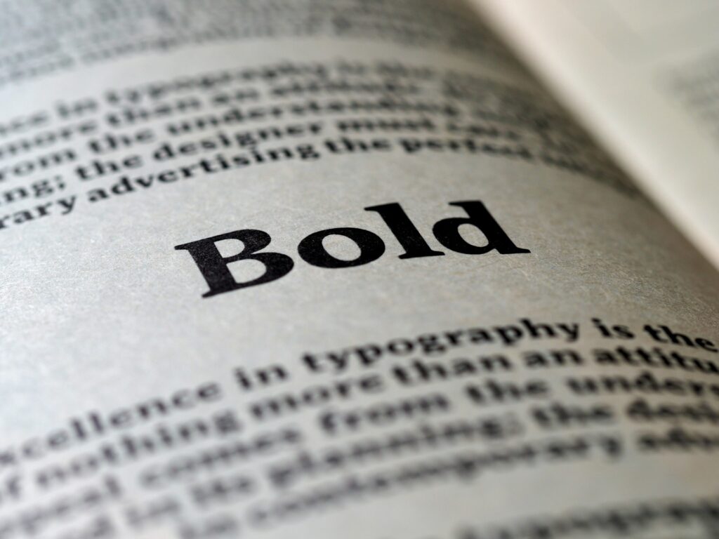
The size of typography is one of the most effective methods for establishing hierarchy. Larger typefaces naturally draw more attention, allowing designers to signify importance. For instance, headings are typically larger than body text, serving as a visual cue to the reader that these portions of text contain vital information. Furthermore, incorporating varying weights, such as bolding specific words or phrases, can accentuate crucial points within paragraphs. This plays a significant role in guiding the reader’s focus, ensuring the most pertinent details stand out.
Color also significantly contributes to typographic hierarchy. Using contrasting colors for headings and body text can help differentiate between different levels of information. For instance, employing a vibrant color for headings and a neutral shade for body content creates a clear distinction, helping to lead the reader effectively through the text. Additionally, spacing plays a pivotal role, as ample white space surrounding text elements enhances readability and allows for a more structured layout.
Incorporating these elements of size, weight, color, and spacing can elevate the effectiveness of typographic design. By developing a thoughtful typographic hierarchy, designers can improve content clarity, assist in engaging readers, and foster a more user-friendly experience.
Color and Contrast in Typography
The integration of color and contrast in typographic design plays a pivotal role in ensuring both readability and aesthetic allure. Appropriate color selection can genuinely enhance the visual experience of text, drawing the viewer’s attention while maintaining clarity. Conversely, poor color choices can lead to misinterpretation of the intended message or, worse, visual discomfort. Therefore, understanding the principles surrounding color and contrast is essential for any designer.
Legibility is the primary factor to consider when selecting colors for typographic elements. High contrast between text and background can significantly improve readability. For instance, using dark text on a light background or vice versa usually offers optimal ocular clarity. That being said, colorblind accessibility must also factor into these choices, necessitating a careful evaluation of color pairings to ensure inclusivity. Tools such as the Web Content Accessibility Guidelines (WCAG) provide necessary standards that should guide designers in achieving adequate contrast ratios.
Moreover, color can evoke emotions and convey messages, thus serving as an essential component of a brand’s identity. For example, warm colors might stimulate excitement, while cool colors could evoke calmness. Designers should aim to harmonize the emotional tone of their typography with their chosen color palette. While experimenting with color combinations, tools such as Adobe Color or Coolors can assist in generating aesthetically pleasing palettes that align with the intended message and brand identity.
In conclusion, effective color and contrast application in typography is not merely an artistic endeavor, but rather a fundamental design principle. Designers must remain aware of legibility and accessibility to ensure that their typographic choices resonate with all audiences. By selecting appropriate color combinations and considering their implications, typographic design can become both functional and visually appealing, thus avoiding common mistakes associated with poor color usage.
The Role of White Space
White space, often referred to as negative space, plays a crucial role in typographic design. It encompasses the empty areas around text and images, providing breathing room that significantly improves user experience. By incorporating white space effectively, designers can create layouts that are not only visually appealing but also enhance readability. When text is surrounded by adequate white space, it prevents feelings of overcrowding, allowing readers to absorb information comfortably.
Moreover, the strategic use of white space helps direct the viewer’s attention to essential elements within the design. For instance, ample space around a heading or a call-to-action can emphasize its importance, guiding the reader’s focus precisely where it is needed. This method enhances comprehension, ensuring that crucial messages are not overlooked amidst busy backgrounds. Consequently, effective white space usage acts as a powerful tool in hierarchy establishment within typographic layouts.
In addition to improving readability and attention focus, white space contributes to creating a balanced and harmonious design. A layout that incorporates well-measured negative space feels more organized and polished. Designers should consider the size and distribution of white space; too much can make the design appear disconnected, while too little can lead to a cluttered appearance. Finding the right equilibrium is essential for achieving a professional aesthetic in typography.
Incorporating white space is an integral skill for any typographic designer. It is beneficial to approach each design project with a mindful consideration of white space’s potential. Along with enhancing readability and directing focus, effective incorporation of white space helps establish a professional and engaging typographic environment. When utilized correctly, white space not only elevates the overall design but also reinforces the message conveyed through the typography.
Typography for Digital vs. Print Media
Understanding typography is crucial for creating effective designs across various media formats. While the foundational principles of typography remain the same, there are distinct considerations when designing for digital platforms compared to print media. The choice of fonts, sizes, and layout must adapt to the specific characteristics and user experiences of each medium.
In print media, typography is typically utilized for static content. Designers have the advantage of knowing that the final product will be viewed under controlled conditions. This allows for careful selection of font families that can enhance readability and aesthetic appeal. For instance, serif fonts are often favored in print because they are perceived to be more legible, particularly in longer texts. Additionally, typographic hierarchy in print can be more complex, utilizing different sizes, weights, and styles to help guide the reader’s eye through the material.
Conversely, digital typography presents unique challenges due to the variability in screen sizes and resolutions. Fonts must not only maintain their integrity across different devices but also remain legible at various resolutions. Sans-serif fonts are commonly used for digital content as they tend to render more clearly on screens. Furthermore, designers must consider interactive elements, such as hyperlinks and buttons, which require distinct typographic treatments to ensure that they stand out and invite user engagement.
Another important distinction is the layout. Print design often employs narrow columns and justified text for polished appearance, while digital layouts benefit from wider spacing and left-aligned text to enhance readability on screens. Adapting typography for both media involves a comprehensive understanding of these differences to ensure that the design remains functional and aesthetically pleasing, regardless of the format.
Conclusion and Further Resources
In summary, typographic design is a fundamental aspect of visual communication that requires careful consideration and a nuanced approach. Throughout this post, key mistakes in typographic design were explored, including the overuse of fonts, neglecting readability, and failing to maintain a proper hierarchy. Recognizing these pitfalls can significantly enhance a designer’s ability to convey messages effectively. By employing best practices such as consistent font choices, proper spacing, and attention to detail, designers can create cohesive and visually appealing work that resonates with audiences.
Continuing to learn and refine one’s skills in typography is essential for any designer aiming to excel in the field. The world of typographic design is continually evolving, and staying updated with trends and techniques is vital for producing exceptional designs. To further enrich your understanding and expertise in this area, a variety of resources are accessible for both novice and experienced designers.
Books such as “The Elements of Typographic Style” by Robert Bringhurst and “Thinking with Type” by Ellen Lupton provide foundational knowledge and insight into the principles of typography. Online platforms, such as Skillshare and Coursera, offer courses tailored to various aspects of typographic design, allowing you to learn at your own pace. Furthermore, websites like Fonts.com and Typewolf are invaluable for discovering new typefaces and understanding their application.
By exploring these resources and cultivating a practice of continuous learning, designers can avoid common typographic mistakes and develop their unique style. This commitment to growth will not only enhance personal skill sets but also contribute to the delivery of impactful, high-quality design work. Embrace the journey of mastering typography and let it elevate your design practice.